Sometimes as designers we can get stuck trying to work out what font combinations work best together.
All design, whether it’s a logo design or brochure, requires the correct font style to create optimum impact.
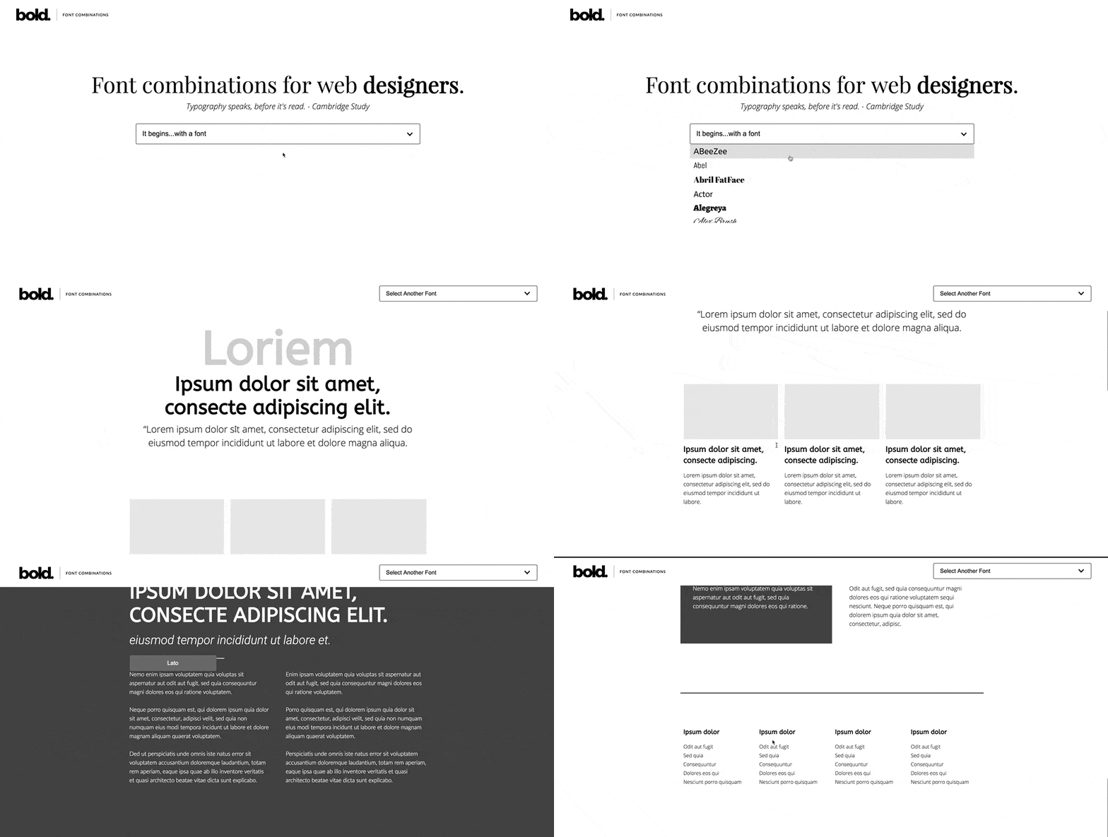
A useful tool for helping you with your next design project was created by Bold Web Design, an Adelaide, South Australian based web design company. They have created a font combination tool that will display font pairing selections for you in a web page layout.
These fonts can easily be downloaded for your next project from Google fonts.
You can view the tool below.
The top 10 font combinations for 2019 have been compiled to assist you in finding the most suitable font pair for your next design project.
Top 10 font combinations for 2019
- Playfair Display with Source Sans Pro
- Merriweather with Oswald
- Montserrat with Merriweather
- Raleway with Lato
- Elsie with Roboto
- Dancing Script with Josefin Sans
- Abril Fatface with Roboto
- Corben with Nobile
- Palanquin with Roboto
- Wendy One with Lato
1. Playfair Display with Source Sans Pro
This would have to be my top font for the year because of its more traditional style design and elegant feel. Its beauty combines the styles of the late 18th century when they used nib quills and the modern use of pointed pens. It was designed by Clau Eggers Sorense, who got his inspiration from such fonts as John Baskerville. This lovely, elegant font should be paired with a delicate font that is simple and thin, like source sans pro.
2. Merriweather with Oswald
A popular text font because it is very easy to read and can be used in many different font weights and heights. It has very lovely serifs that highlight its intrigue. It can be paired with a sans-serif font like Oswald
3. Montserrat with Merriweather
A modern design, created by Julieta, and named after the town in which she lives and works, Montserrat. This is one of our top picks because it’s very modern and can be used in many different widths and heights. Often a very simple font such as this can be paired with a serif font like Merriweather to create an interesting contrast.
4. Raleway with Lato
Raleway was designed with the intention of being used for headings or large sized text. Created by Matthew McInerney, then expanded upon by Pablo Impallari and Rodrigo Fuenzalida in 2012. It’s a thin, delicate font that looks perfect paired with Lato, as both have similar gentle serif.
5. Elsie with Roboto
I simply adore this font style. Developed by Alejandro Inler with Ana Sanfelippo who wanted to design a font that appeared feminine. I think this font could be used for a modern perfume brand because it feels soft and delicate. As this font is rather detailed, it should always be paired with a sans-serif font, like Roboto, to compliment its features.
6. Dancing Script with Josefin Sans
Based on the popular typefaces of the 50’s, this script style font flows beautifully. I think that script fonts are becoming more popular because they give a feeling of movement. It creates interest and excitement, and needs to be paired with another elegant font like Josefin sans. It softly compliments the flowing lines of Dancing Script, while also providing its own unique interest.
7. Abril Fatface with Roboto
This bold, out-there font style captures your attention and imagination. It was designed by TypeTogether and based on the popular poster designs from Britain and France in the 19th century. With its bold, thick lines, Abril Fatface is paired with a complimentary thin sans-serif font, like Roboto.
8. Corben with Nobile
Designed by Vernon Adams to be easy on the eye, and with a touch of the classics. I love the unique rounded serif that this font has. It is bold and stands out from the crowd. A perfect match for a straight lined, simple font style like Nobile.
9. Palanquin with Roboto
An easy to read font style makes for an impressive one. It was designed by Pria Ravichandran with the inspiration of the modern digital age. An excellent pair for Palanquin is Roboto, as it has very straight lines.
10. Wendy One with Lato
A font with interesting, unique features. It was inspired by the Stabilo logotype and developed by Alejandro Inler with Julieta Ulanovsky. I love that this font varies in shape and doesn’t keep the same size edges. If feels like there’s always something different to look at with each letter. It is lovely to pair it with a simple font like Lato.


